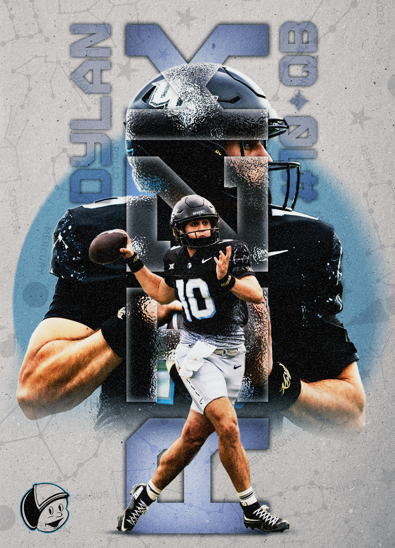
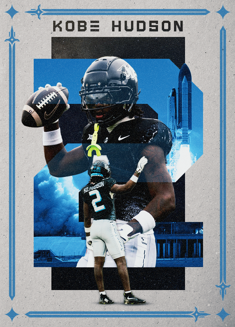
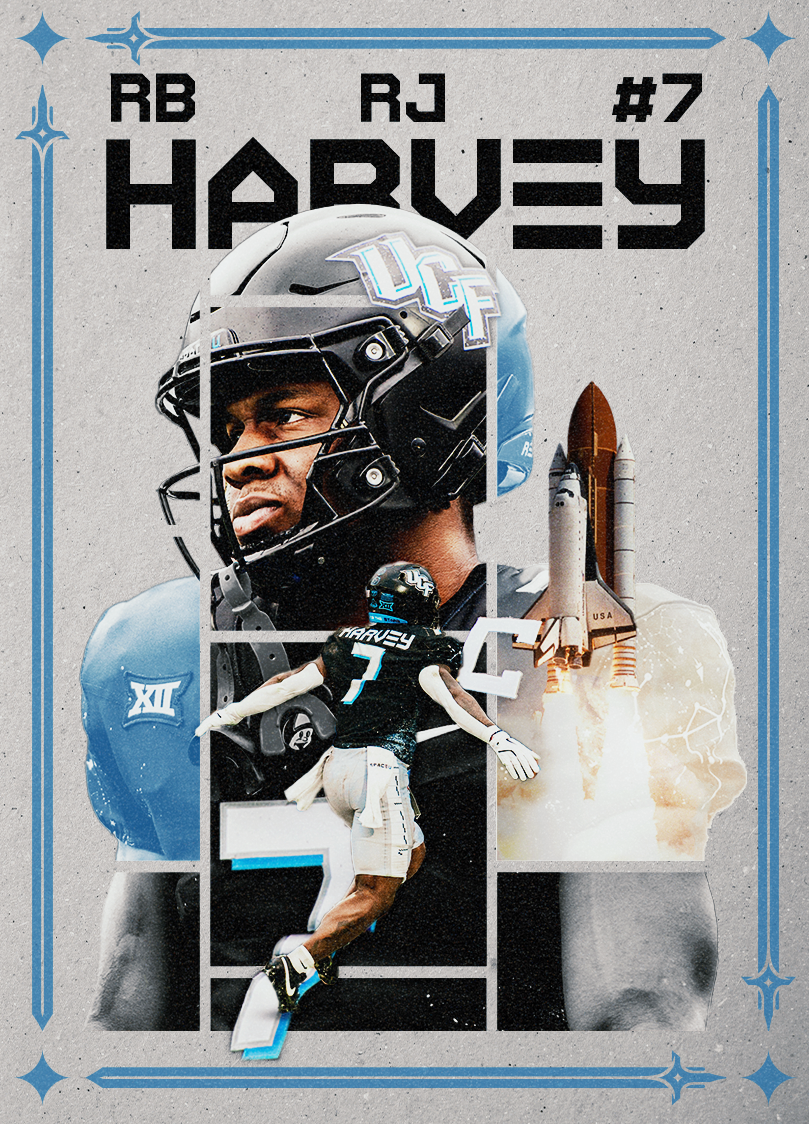
THE FOOTBALL SET IS THEMED WITH THE ANNUAL UCF SPACE GAME as its main focus. the space game has been a staple of ucf athletics since its debut in 2017, and ever since the ties to the space coast have only grown. these cards take into account the citronaut branding, colors, and uniforms worn, specifically during the 2024 season. each card focuses on utilizing the "space u" font alongside elements such as rocket ships and constellation patterns to emphasize the link between the school and the space program.
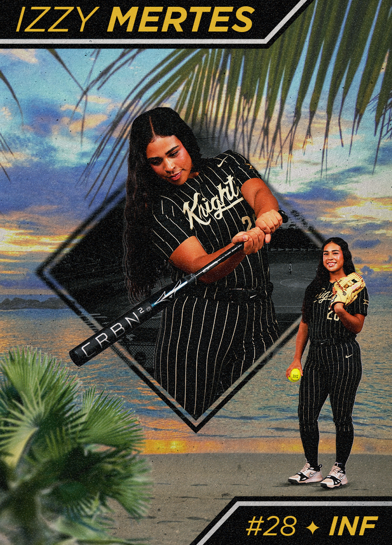
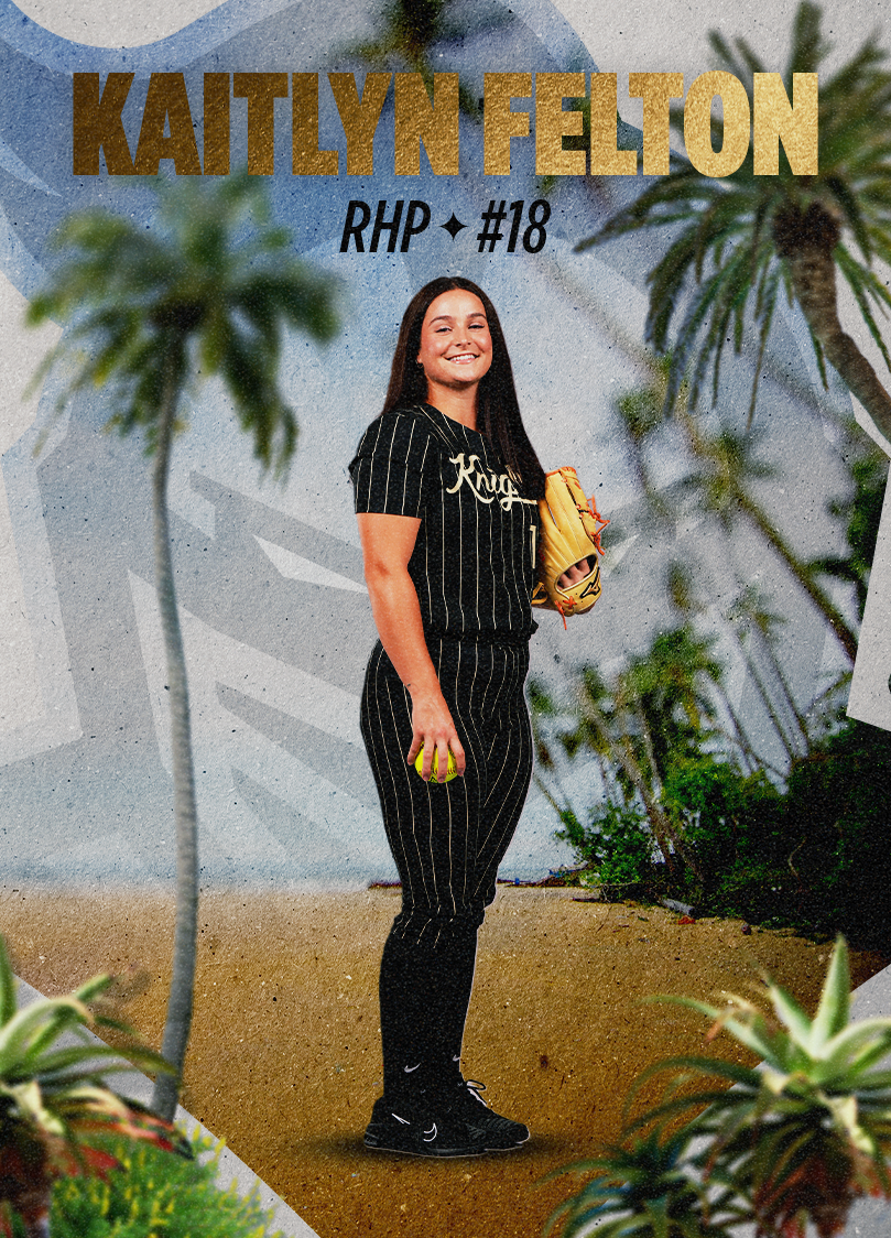
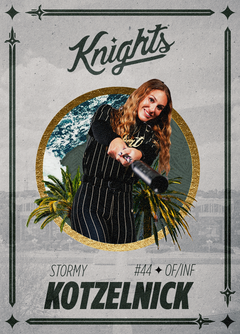
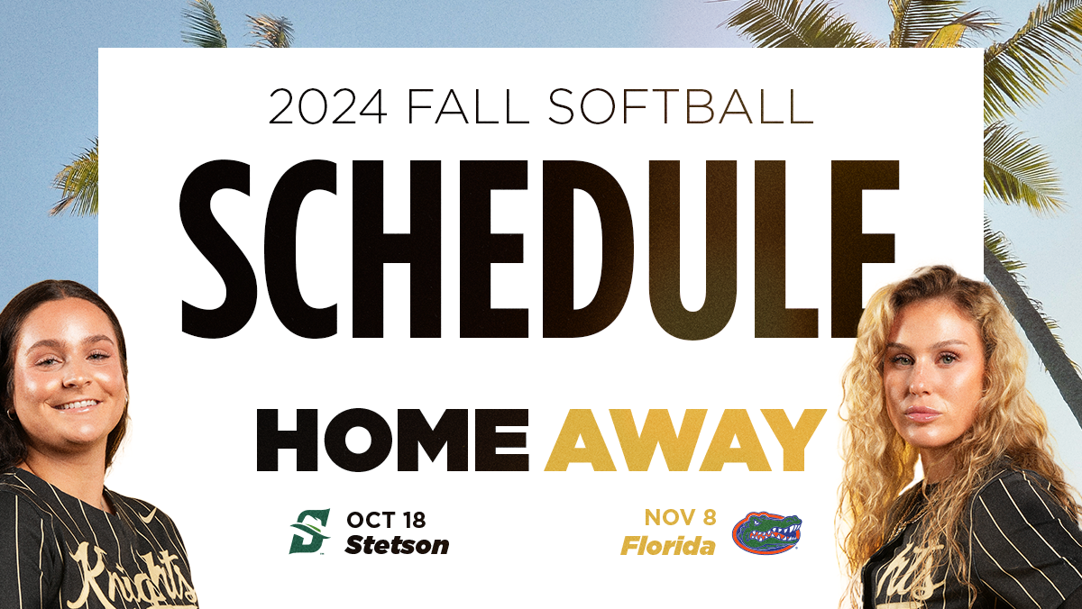
THE SOFTBALL SET IS THEMED AROUND FLORIDA'S WORLD-CLASS BEACHES. THE UCF BRAND HAS ALWAYS INCLUDED HEAVY TIES TO THE BEACH, OFTEN USING ELEMENTS SUCH AS PALM TREES AND THE OCEAN TO DRIVE HOME THIS CONNECTION. THESE ELEMENTS BEING SO CRUCIAL TO THE UCF BRAND LED ME TO USE THEM IN THESE DESIGNS, ALONGSIDE USING UCF'S SIGNATURE GOTHAM FONT. THEY ALSO FEATURE THE KNIGHTS SCRIPT TEXT AND KNIGHTRO LOGO, FURTHER COMBINING THE ELEMENTS OF THE SCHOOL AND THE BEACH.
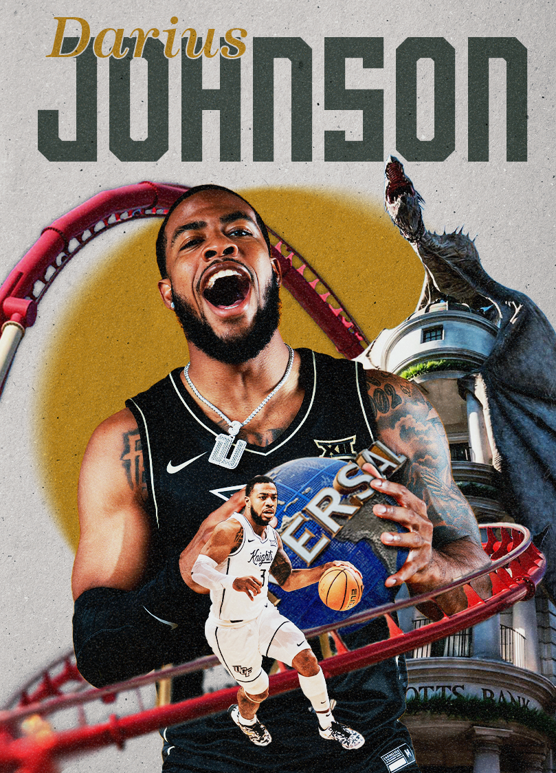
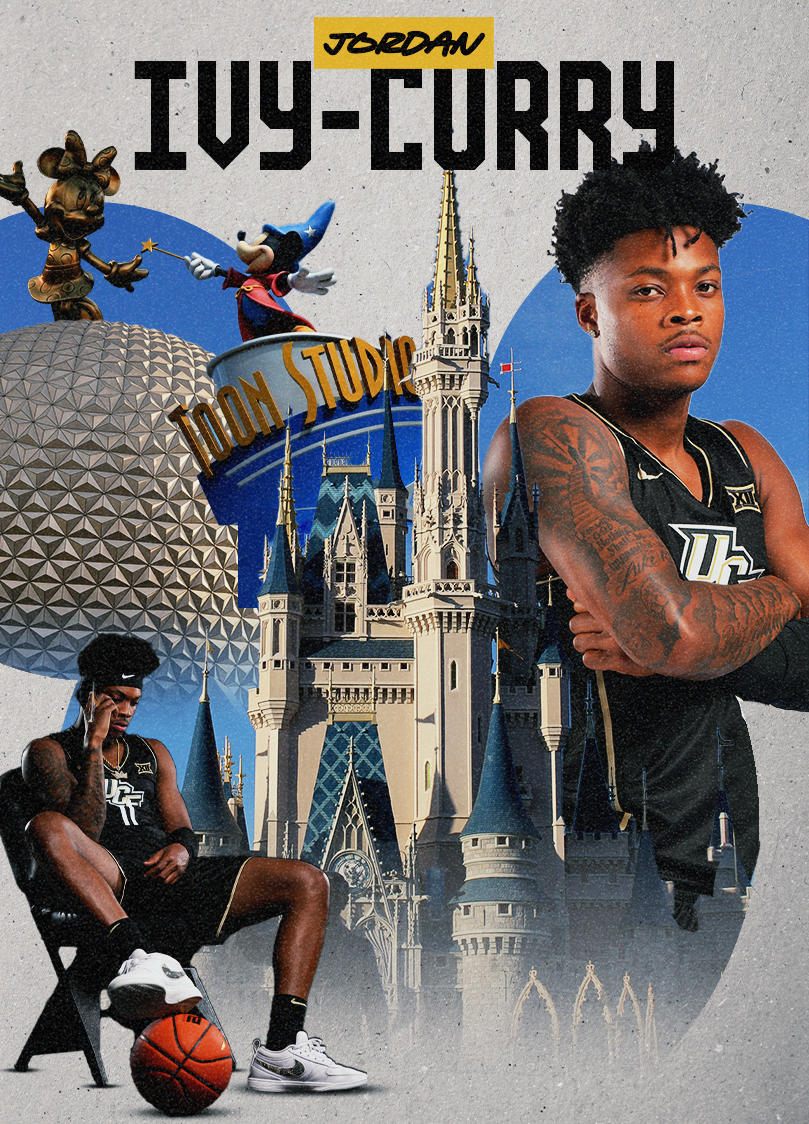
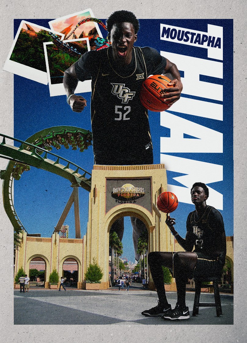
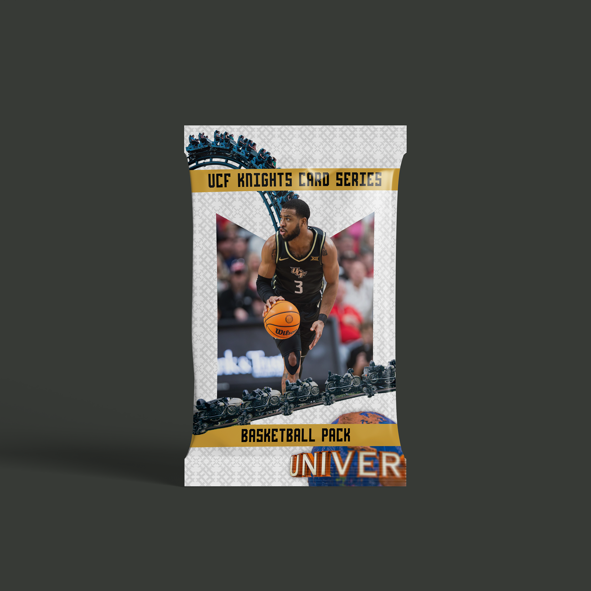
the basketball set of cards features orlando's connection to theme parks and entertainment. the city is well-known for hosting disney world and universal orlando resort, and these cards feature these ties to the city. each card has its own unique theme to it, with each one representing a different world-famous park. these cards employ the most iconic features from each park, from rip ride rockit to cinderella's castle to the incredible hulk rollercoaster. these cards bring to light the hometown of ucf, connecting the school to the city beautiful.
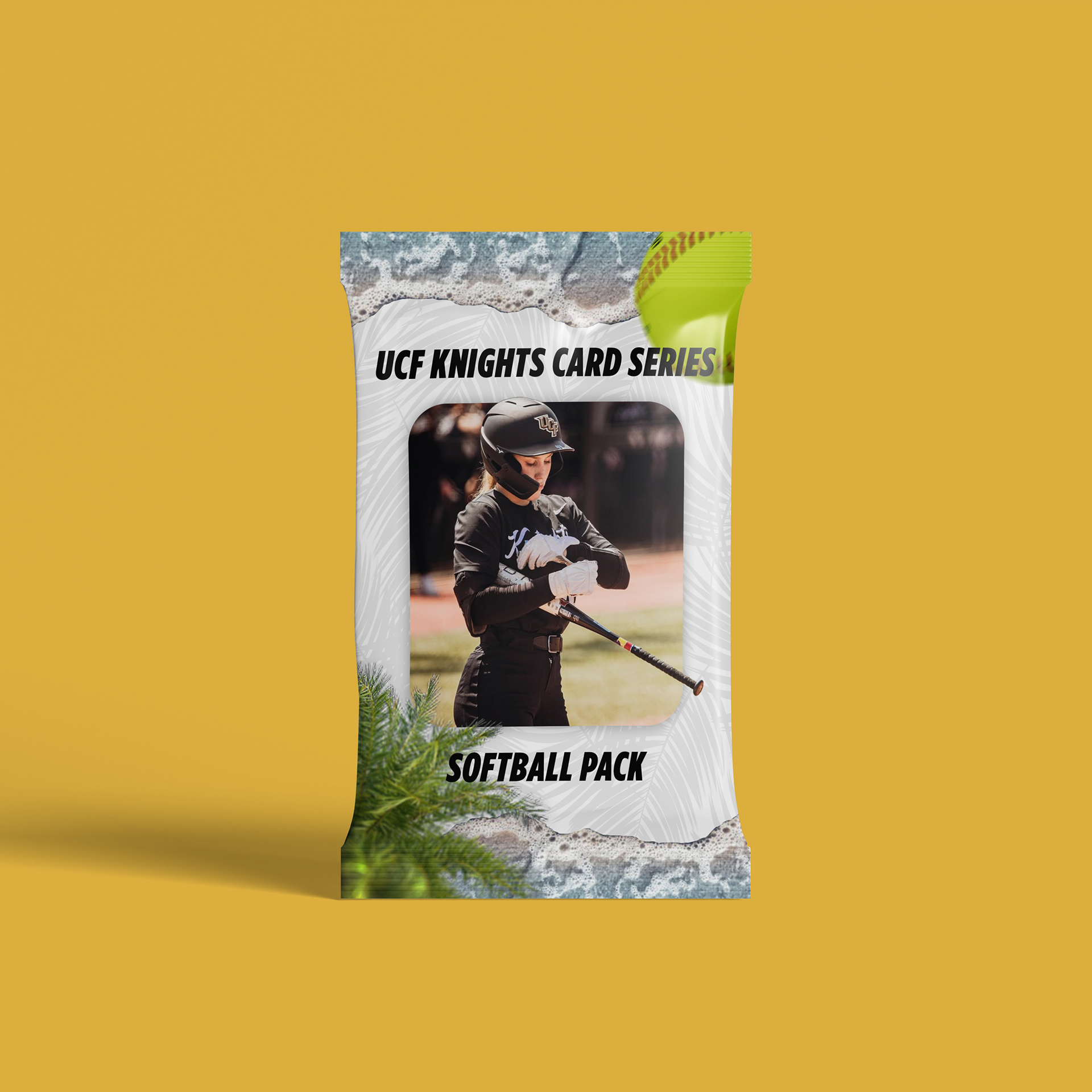
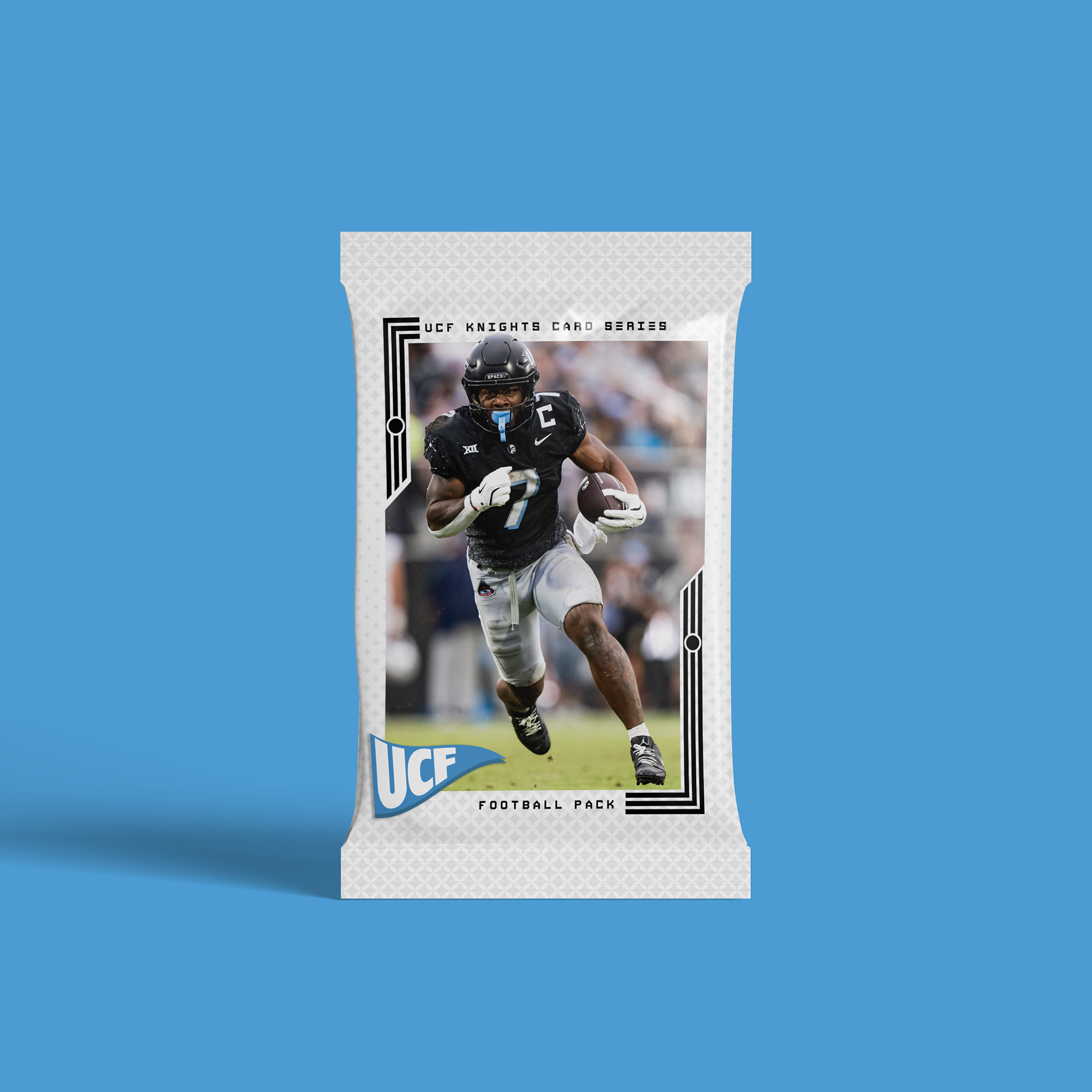
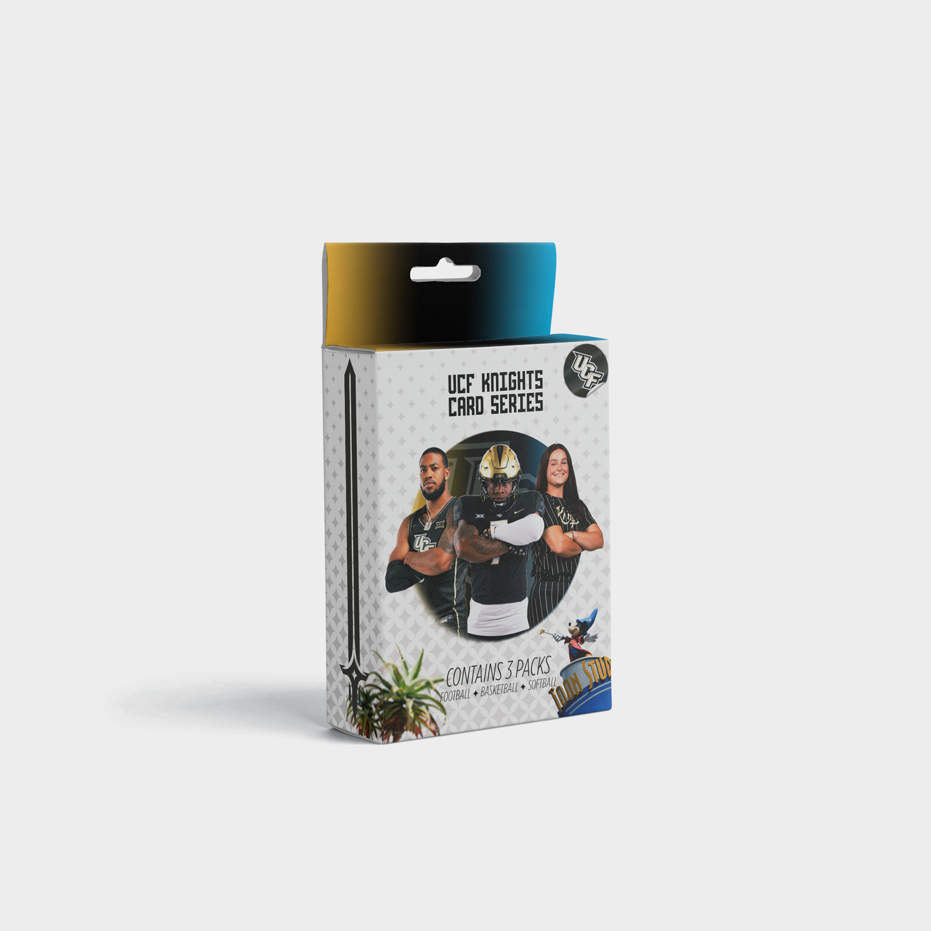
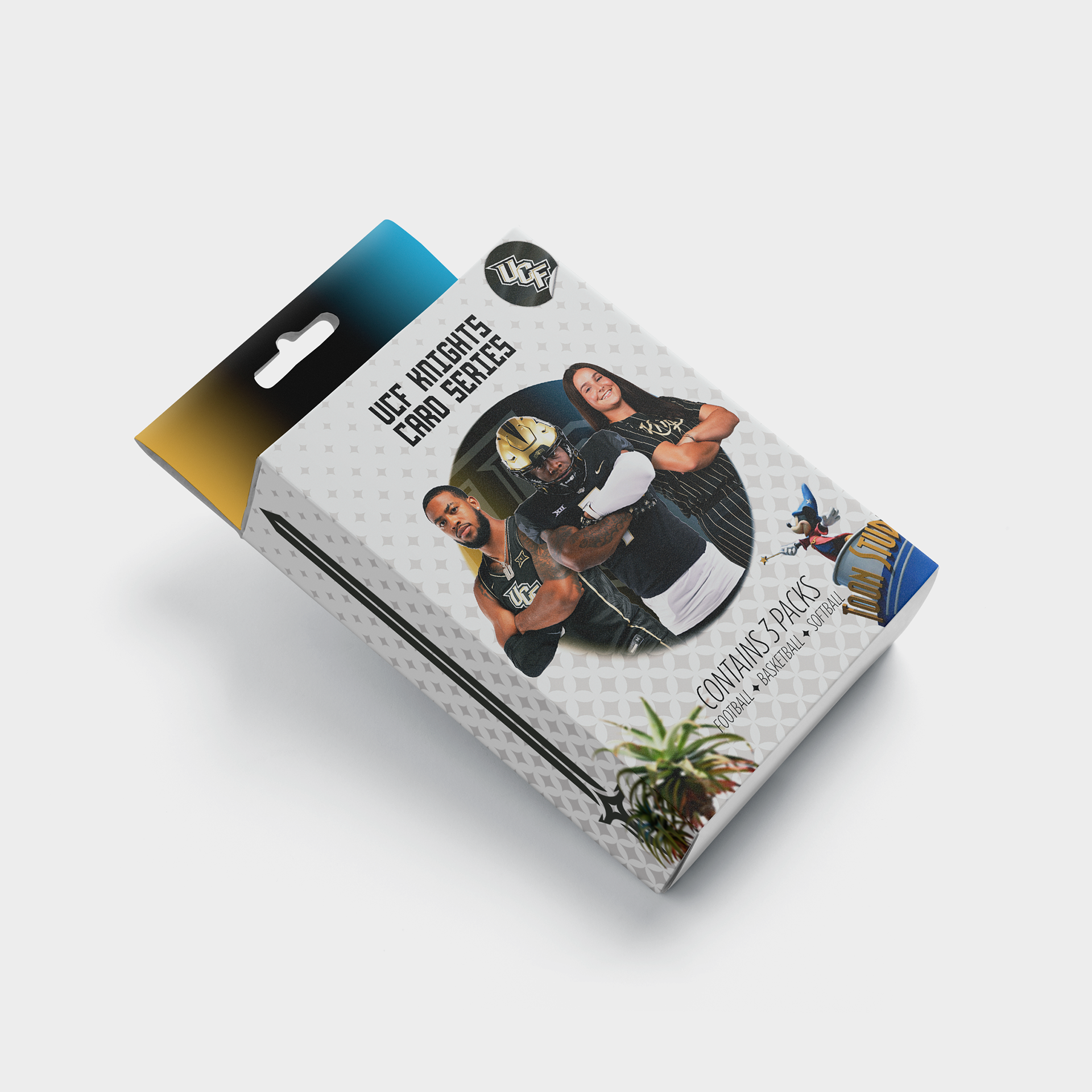
finally, these card sets are all tied together with the packaging designs of each set, alongside the box that combines all three key themes together. each card packaging features a different iconic ucf font, encompassing all aspects of ucf branding alongside the unique themes each set represents. the box packaging features a player from all three sports over a gradient from the knights gold FADING INTO BLACK FADING BACK OUT TO CANAVERAL BLUE. THE DESIGN ALSO INCORPORATES ONE ELEMENT FROM EACH THEME, WITH A DISNEY PARK STATUE, A PALM TREE, AND THE POLARIS STAR BACKGROUND TO REPRESENT THE THREE THEMES IN A DISTINCT WAY. THIS PROJECT HAS HELPED ME GROW IMMENSELY AS A DESIGNER, FROM PLANNING OUT A BRANDING CAMPAIGN TO INCORPORATING VASTLY DIFFERENT THEMES IN A CLEAR AND COHESIVE WAY. OVERALL, THE FINAL PROJECT DEMONSTRATES HOW CRITICAL A CONSISTENT THEME IS TO PRESENTING A FULL AND POLISHED PRODUCT.